
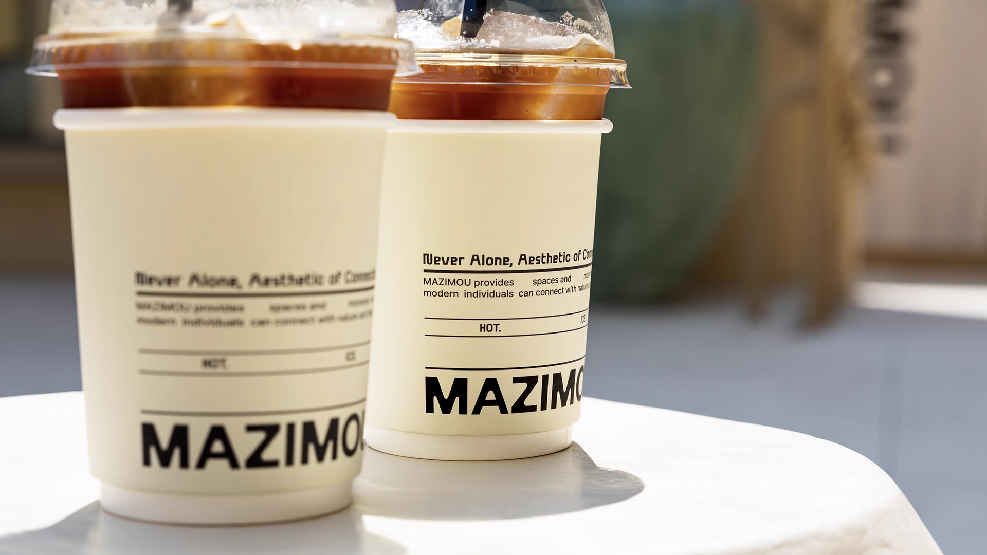
Studio Lens have developed a calm, intentional identity for MAZIMOU - a concept space shaped around the idea of stillness, reflection, and togetherness. The name, a combination of the Greek words for “together” (mazi) and “myself” (mou), sets the tone for a brand that resists overstimulation in favour of quiet presence.
Rooted in that idea, the visual language is understated yet adaptable. The custom logotype features rounded, open forms that sit somewhere between character and gesture, offering both clarity and softness. Its structure allows it to flex across applications without losing its gentle rhythm. Paired with a muted, natural palette and a restrained graphic system, the brand behaves less like a traditional identity and more like a sensory frame, supporting the environment rather than decorating it.
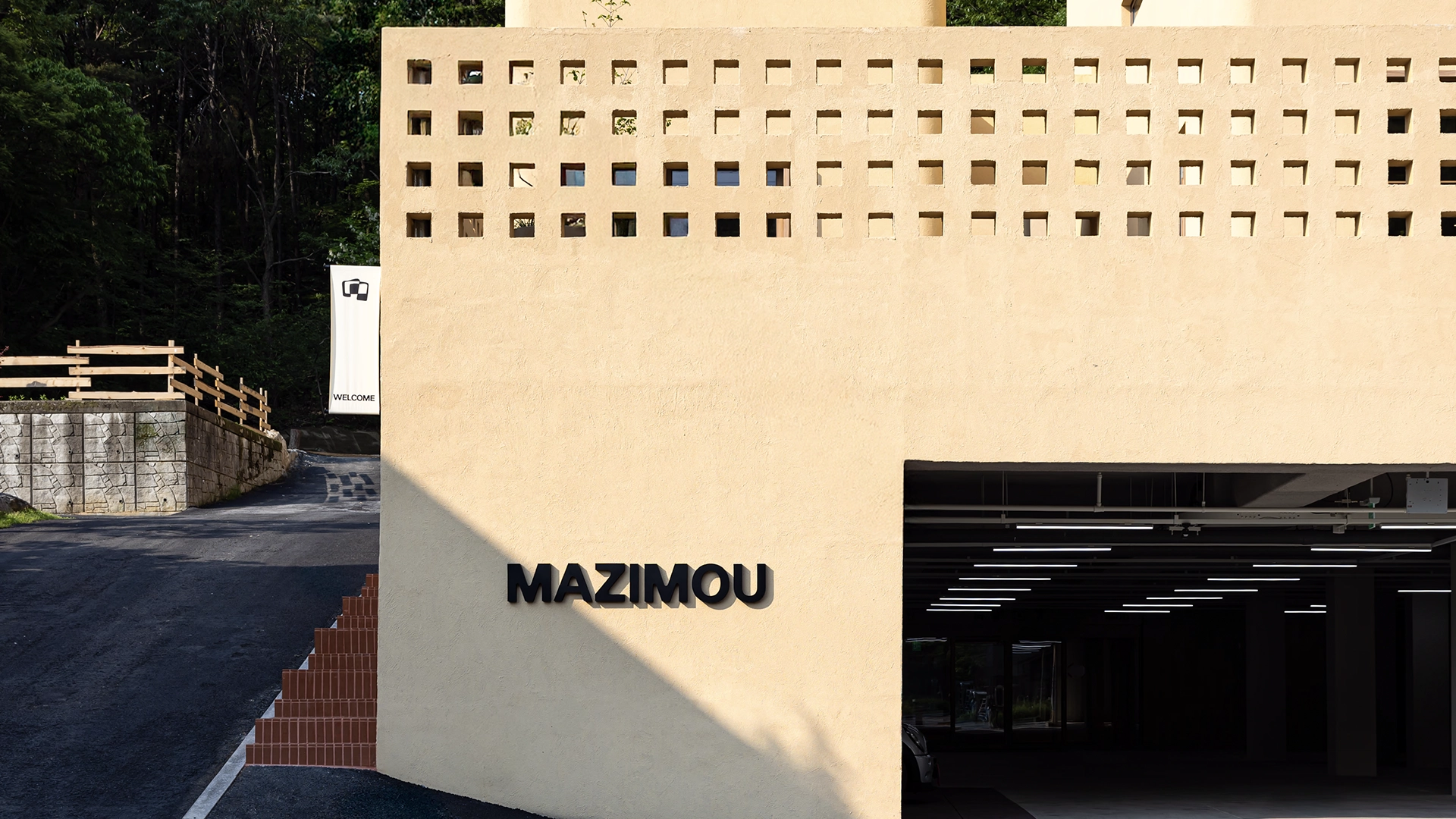
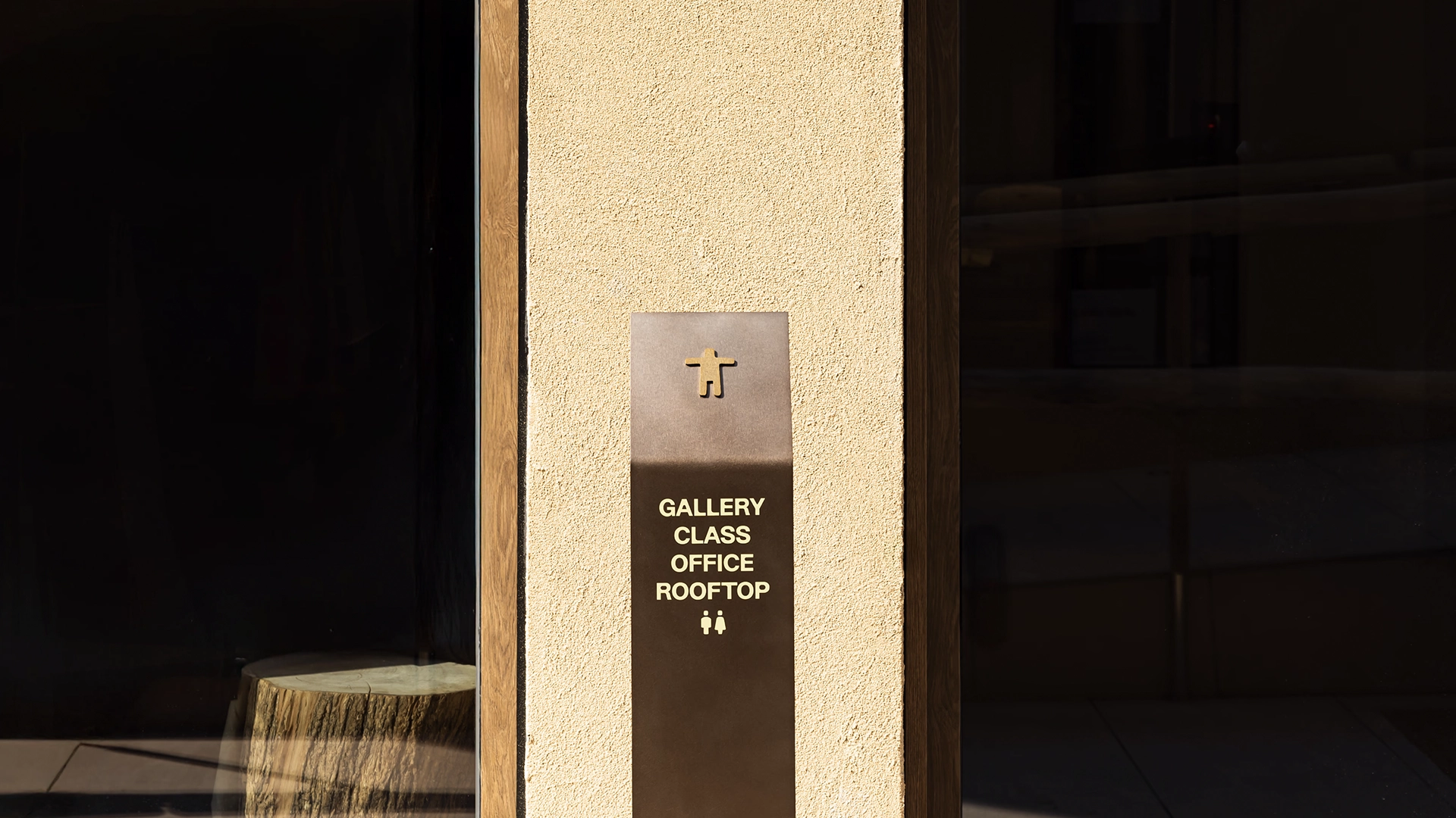
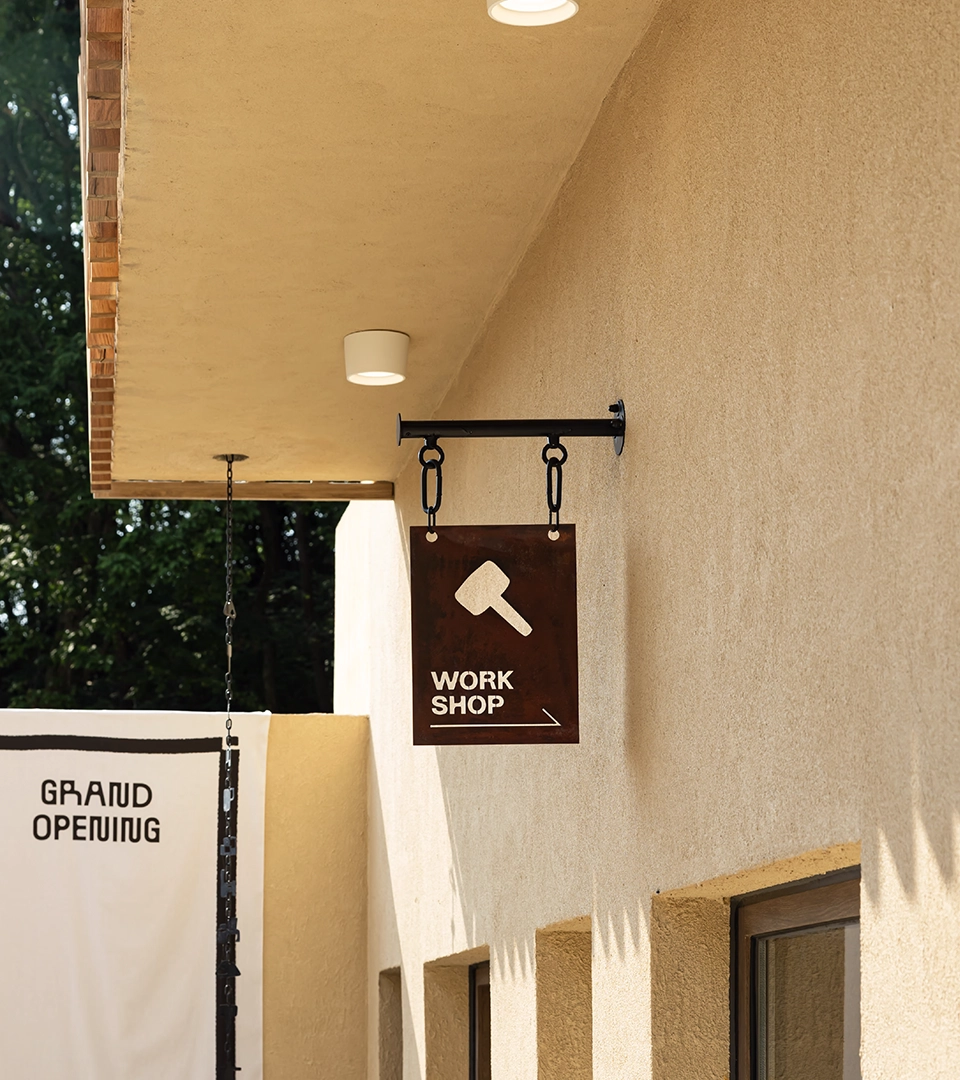
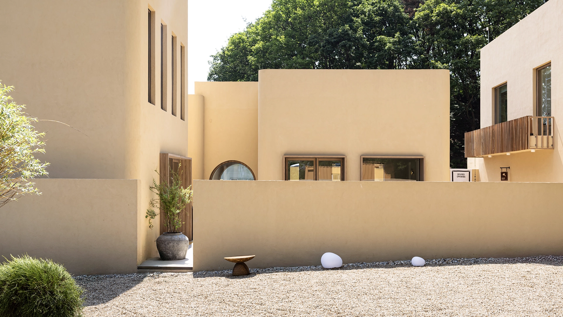
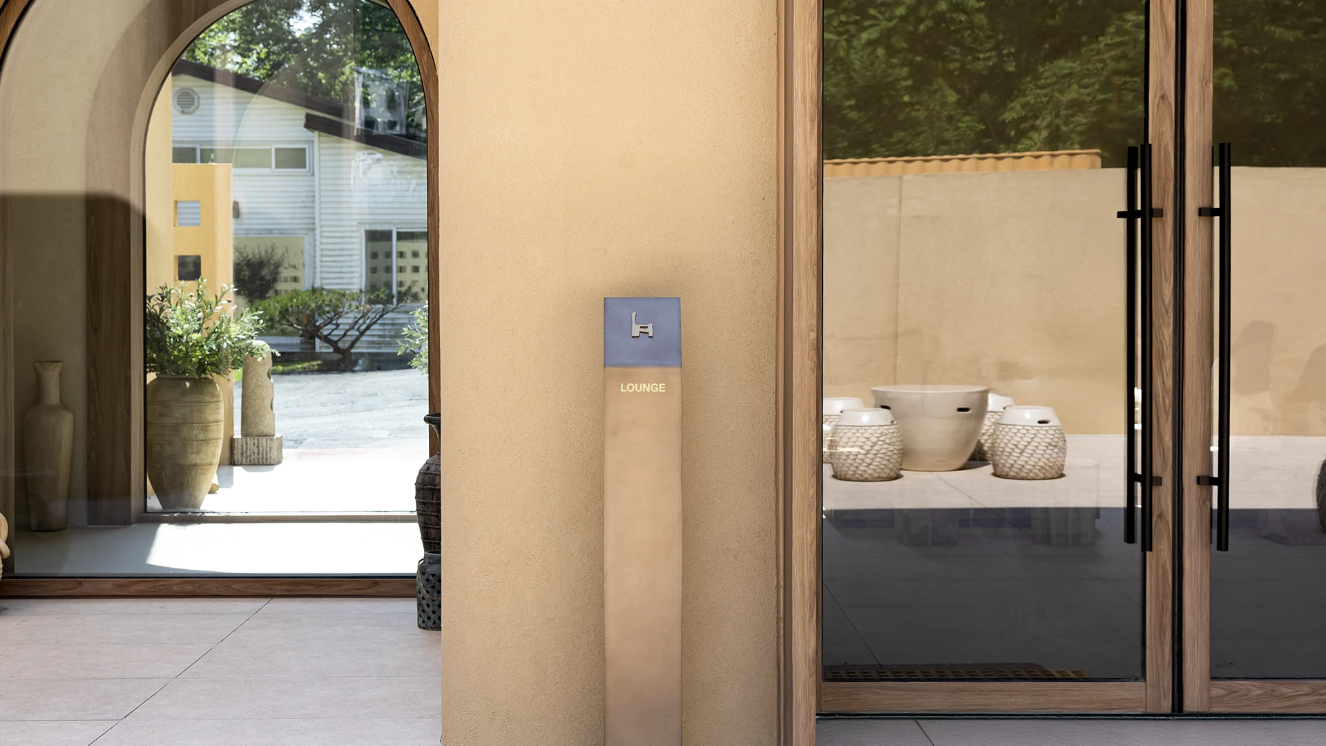
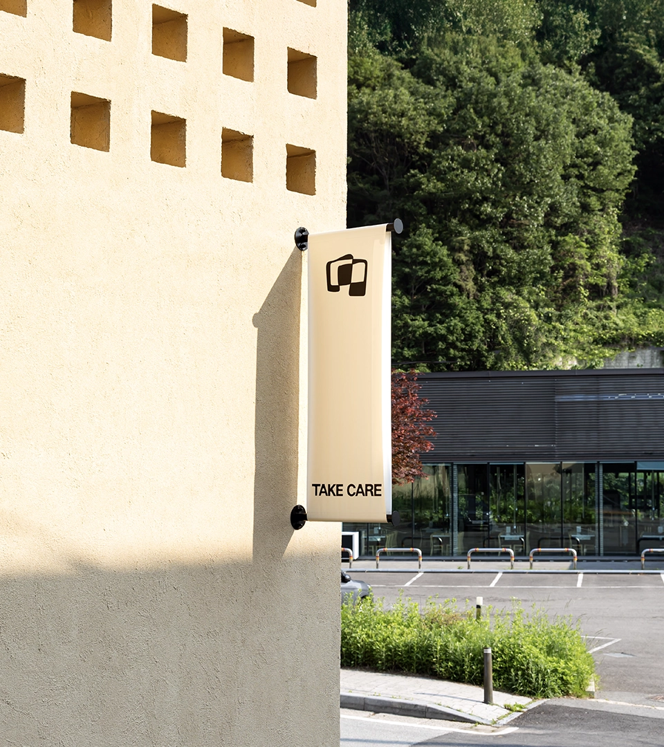
Spatial design and signage were considered from the beginning. Wayfinding elements use minimal intervention to guide movement through the space, while environmental graphics remain subtle, often integrated into material finishes. Everything is calibrated to feel quiet and coherent.
The result is a brand system that slows things down, not for effect, but as a function of its purpose. Rather than broadcasting, MAZIMOU invites. Studio Lens has created an identity that doesn’t assert itself visually but instead supports the conditions for pause, presence, and connection.
See the full case study by Studio Lens
