
Rebranding a globally recognised institution presents unique challenges, especially one with a rich history like London's Royal Opera House. Recently, this iconic venue undertook a significant transformation, adopting the new name Royal Ballet and Opera (RBO). This change was accompanied by a comprehensive new brand identity, developed by DesignStudio.
This evolution was rooted in a clear strategic objective. The name "Royal Opera House," intrinsically linked to the historic Covent Garden building, didn't fully represent the equal partnership and international acclaim of its two resident companies: The Royal Ballet and The Royal Opera. The rebranding initiative sought to address this, creating a unified identity that celebrates both art forms equally, resonates with loyal patrons, and importantly, aims to welcome new and diverse audiences.
Working in close partnership with the RBO's internal teams, DesignStudio developed a central strategic concept named the "Living Timeline." This idea serves as the foundation for the entire brand identity. It aims to weave together the institution's significant heritage with its vibrant present-day activities and forward-looking ambitions. The "Living Timeline" concept provides a narrative framework for communicating the RBO as a dynamic entity, constantly evolving through its performances, artists, and community engagement.
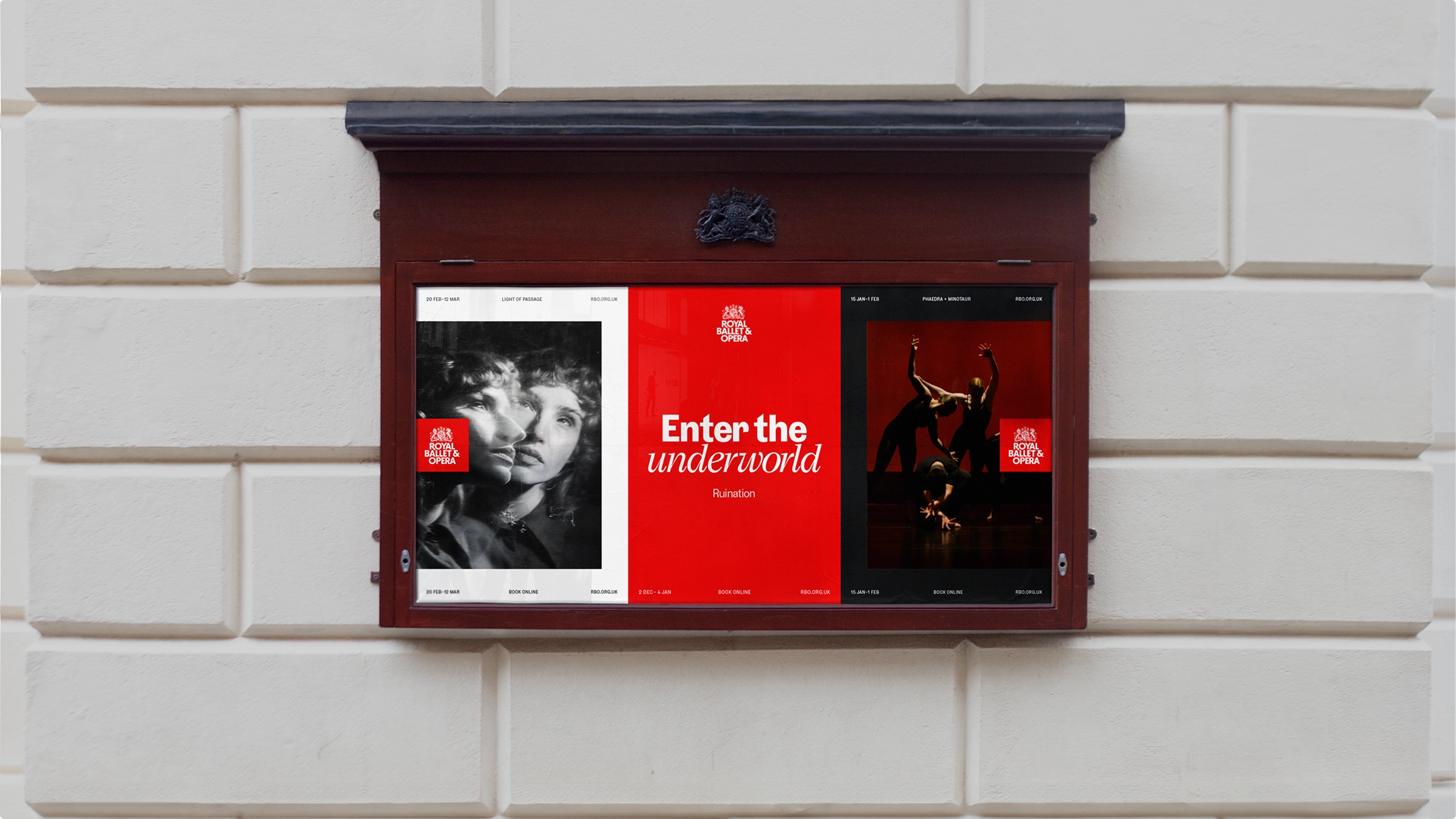
Translating the "Living Timeline" strategy into tangible assets involved carefully crafting several key visual components and a cohesive system. The marque, a core visual symbol, was reimagined from the RBO's archives, creating a fluid, contemporary mark rooted in history that evokes both ballet and opera.
Complementing this, the typography pairs the elegant Victor Serif with the clear, modern Grey sans-serif, providing versatility for diverse communications. The colour palette features an updated signature red optimised for digital platforms, alongside an extended palette drawn from past productions, allowing for tonal flexibility.
Finally, a refreshed verbal identity and a dynamic layout system work together to ensure brand cohesion and adaptability across all applications, bringing the strategy to life consistently.


This comprehensive rebrand by DesignStudio represents a significant strategic undertaking for the Royal Ballet and Opera. The primary goals are clear: achieving a unified identity that firmly establishes the RBO brand as equally representing both world-class ballet and opera; broadening audience engagement by connecting with a wider demographic through a modernised and welcoming identity; ensuring digital cohesion so the brand is effective and consistent across all digital touchpoints; and empowering internal teams by providing them with a robust and flexible brand toolkit.
In conclusion, the transformation of the Royal Opera House into the Royal Ballet and Opera, visually guided by DesignStudio, is more than just a rebranding exercise; it's a strategic repositioning. It highlights how legacy institutions can evolve their identity to reflect structural changes and connect with contemporary audiences while respecting their history. The project offers valuable insights for branding professionals into this delicate balance, demonstrating how strategic design can help cultural powerhouses strengthen their global presence and secure their future in an ever-changing landscape.
See the full case study by DesignStudio
